
MIFX
Pilot Project: Quick Trade Navigator
In a Nutshell
Quick Trade Navigator is a pilot pre-trade reference tool designed to help traders make faster and more confident trading decisions by combining technical and fundamental insights in one place.
Beyond solving a user need, this project became the first internal pilot for adopting Framer, a new website-building tool that I pitched and implemented end-to-end.
Initially distributed through WhatsApp, the page saw low adoption and almost no repeat visits. After repositioning it directly inside the Home section of the app, performance improved significantly and repeat visits increased, the page became part of users’ pre-trade routine, and it contributed a good trading volume(lot).
This project demonstrated how strong distribution, combined with the right UX and content strategy, can unlock real business impact without changing the core design.
Quick Trade Navigator is a pre-trade reference page designed to help traders make faster and more confident trading decisions by presenting clear, relevant insights before they execute a trade.
The project was initiated by the Product Manager team (Trading Tools) and developed through cross-functional collaboration involving CRM, Art, Marketing (Copywriting), and a CX Designer.
In parallel, this project also served as the first pilot initiative for adopting Framer, a new website-building tool that I pitched and implemented within the company. Beyond delivering user value, the project was used to validate a new workflow for building, scaling, and iterating on lightweight, high-impact trading tools.
Objective
The main objectives of this project were to:
Encourage traders to revisit the page regularly.
Position the page as a trusted pre-trade reference.
Build a habit of checking insights before executing a trade.
My Role
I worked on this project end-to-end, taking on dual responsibilities as both a designer and a developer.
As a designer, I was responsible for defining the user experience, user flows, and visual interface. Ensuring the information was easy to scan, relevant, and actionable for traders.
As a developer, I built and deployed the experience using Framer, translating designs directly into a live, production-ready page. This dual role allowed for faster iteration, tighter feedback loops, and more efficient collaboration with cross-functional teams.
How I Design
The project followed a user-centered design approach, starting with identifying target users and understanding their trading behaviors particularly how they gather information before executing trades.
To support scalability and long-term use, I designed a flexible CMS structure that allowed multiple pages to share the same layout while displaying different product content. The CMS was powered by Airtable as a third-party solution, enabling easy content updates and collaboration across product, marketing, and CRM teams without requiring design or engineering changes.
The page was structured around two main content pillars, each serving a different but complementary decision-making need:
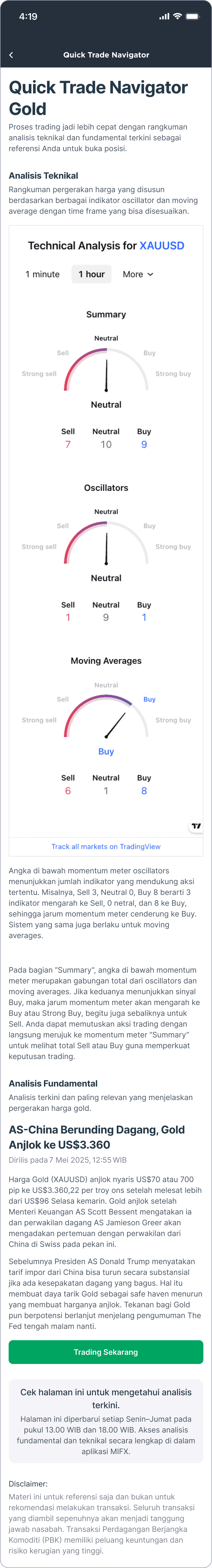
Technical Analysis
For technical insights, we embedded TradingView widgets via iframe to surface real-time charts and signals directly within the page. Rather than rebuilding complex charting or indicator logic, this approach allowed us to leverage a trusted external tool while keeping the experience fast, reliable, and focused on action.Fundamental Analysis
For fundamental insights, the content was updated manually with CMS by the Product Manager (Trading Tools) team. This section focused on contextual information such as news, market narratives, or product-specific insights that could not be captured through charts alone. The layout was designed to support frequent updates and easy scanning, ensuring the content stayed relevant and timely.
By combining automated real-time technical signals with manually curated fundamental insights, the page provided a more complete pre-trade perspective to helping users balance data-driven signals with market context.
At the end, I've put a button that redirects to chat so users can trade immediately after reading.
Preview
Result & Impact
The results of this project were highly dependent on distribution strategy and channel selection.
In the early phase, the Quick Trade Navigator was distributed primarily through WhatsApp (WA). While this approach generated initial traffic, adoption remained low. There were minimal repeat visits, and some users even contacted Customer Support asking how to access the page again.
Based on these findings, we adjusted the distribution strategy by embedding Quick Trade Navigator directly into the Home section of the app. This change significantly improved performance and exceeded expectations.
After the placement change:
Repeat visits increased substantially, indicating stronger habit formation
The page became part of users’ regular pre-trade flow
Trading activity driven by the page increased, contributing a high trading volume (lot)
This shift highlighted that the product itself was valuable, but required the right placement and visibility to unlock its full impact. By aligning the experience with users’ natural trading entry points, Quick Trade Navigator was able to deliver meaningful behavioral and business outcomes.
Tools & Methods
Design & Development: Framer
CMS: Airtable
Approach: User-centered design, data-informed iteration
What I've Learnt & Special Thanks
This project reinforced several important lessons:
Distribution strategy can have a major impact, even when the design remains unchanged.
Pre-trade tools require sufficient exposure before they become part of user behavior.
Combining UX design, content strategy, and data-informed evaluation leads to measurable business outcomes.
Owning both design and implementation enables faster iteration and clearer accountability.
Shoutout to all collaborators
Huge shoutout to everyone I collaborated with during this project:
Bianca Abigail - Product Manager(Trading Tools) a.k.a owner this project
Product Manager Team(Trading Tools)
CRM & Growth Team
and many more others.