
MIFX
Leverage: Design System
In a Nutshell
The Design System drove measurable improvements in both design efficiency and team workflows, while maintaining strong adoption discipline.
Result:
99.39% of components remained attached to their main components, with only 0.61% detached.
File setup time was reduced to only 30 seconds
Component maintenance and updates became automatically.
The overall file and component structure became significantly more organized.
Switching variable modes required only 2 clicks
What You Looking For: Documentation
As MIFX continued to grow and prepared for a major app redesign, the need for a scalable and reliable design foundation became increasingly clear. To support this transition, the team decided to invest in a centralized design system.
I was entrusted to continue leading the development and ongoing maintenance of the design system ensuring it could serve as a single source of truth across the product while supporting both current needs and future growth.
Why We Needed a Design System
As the product scaled and a major app redesign was planned, our existing design approach no longer held up. Design decisions were spread across files, patterns were applied inconsistently, and there was no single source of truth to support rapid change.
Operational Challenges
Simple updates such as adjusting spacing, typography, or component behavior required manual changes across multiple files and screens. This made iterations time-consuming, error-prone, and difficult to scale as more teams became involved. This approach began to slow down delivery, increase maintenance costs, and make consistency harder to maintain.
The design system was introduced at this moment to create consistency, reduce risk, and enable the redesign to move forward with speed and confidence.
Design System Goals
Create a shared foundation
Establish a single source of truth to maintain visual and interaction consistency across products and platforms.
Improve efficiency and scalability
Reduce repetitive work and design debt by centralizing components and updates, enabling faster and safer iteration.
Support long-term product evolution
Provide a stable foundation that supports ongoing development and future initiatives, including the app redesign.
How I Build Components
The foundational tokens and visual guidelines were initially defined by a senior designer. I built on top of this foundation by structuring, scaling, and maintaining the component system to ensure long-term consistency and usability across products.
Rather than designing screens in isolation, components are built using a structured hierarchy. The system starts with foundational elements such as colors, typography, spacing, and icons which are then combined into reusable components. These components are further composed into higher-level patterns used across core user flows.
This layered approach reduces duplication, keeps the system flexible, and allows changes to be made at the appropriate level without unnecessary rework or breaking existing layouts.
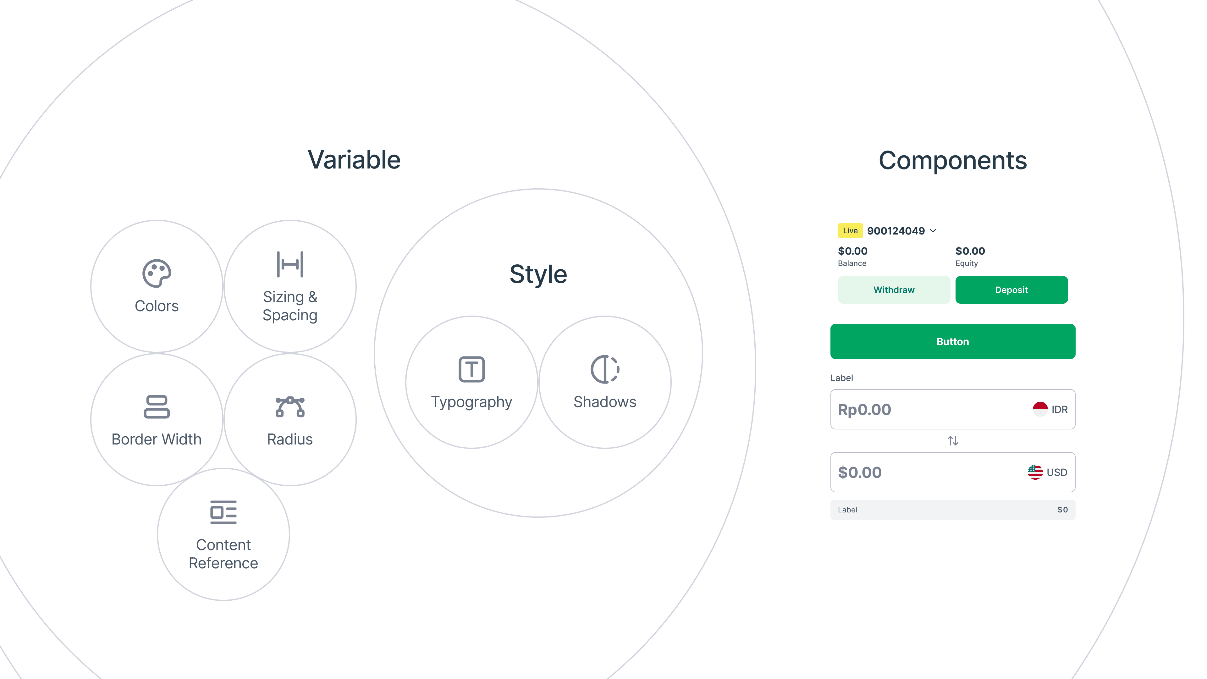
This hierarchy ensures the design system stays scalable, consistent, and adaptable as the product evolves.
Leveraging Figma Branching
To manage changes safely and keep the system organized, I leveraged Figma’s Branching feature (available on the Organization Plan). This allowed the Design System to function similarly to GitHub-style workflows.
All stable components lived in the main file, while updates or experiments were developed in branches. When a change was ready, it could be reviewed and merged back into the main system without disrupting ongoing work.
This approach significantly reduced risk, improved clarity, and kept the file structure clean and maintainable.
Results & Impact
The Design System delivered clear, measurable improvements in both design efficiency and team workflows, while maintaining strong adoption across the organization.
From a usage standpoint, 99.39% of components remained attached to their main components, with only 0.61% detached. These detached instances mostly occurred during early exploration or experimentation, indicating healthy usage rather than misuse.
The system also delivered clear operational gains:
File setup time was reduced to only 30 seconds, enabling faster onboarding and project kickoff.
Component maintenance and updates became 5× faster, as changes could be made once at the core component level and propagated automatically.
The overall file and component structure became significantly more organized, improving scalability and collaboration across teams.
Switching variable modes required only 2 clicks, reducing friction when working across themes, states, or contexts.
Together, these results demonstrate that the Design System not only improved visual consistency, but also streamlined workflows, reduced manual overhead, and enabled teams to ship with greater speed and confidence.
What You Looking For
What I've Learnt & Special Thanks
This project reinforced the importance of system thinking, careful governance, and deep product understanding when designing at scale.
Shoutout to all collaborators
Huge shoutout to everyone I collaborated with during this project:
Jose Devian - Senior CX Designer
Agung - Head of CX & Design
This system wouldn’t have been possible without the trust, feedback, and collaboration from the entire team.